

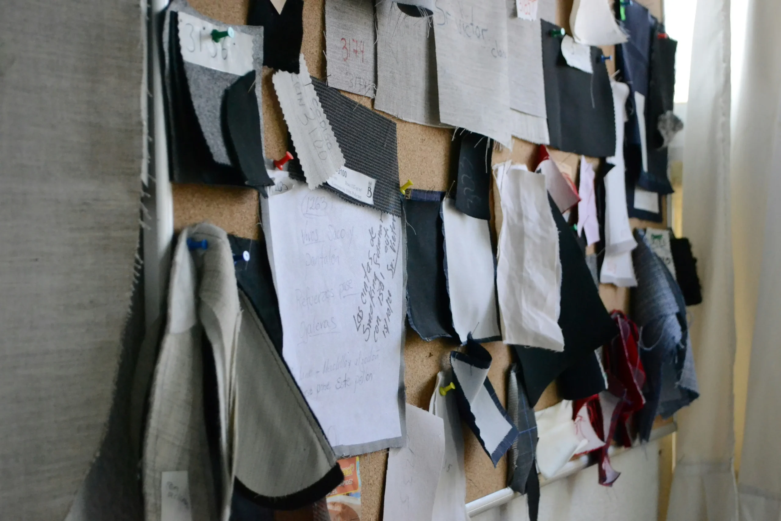
custom fabric color matching is the first checkpoint buyers should lock before they approve a supplier, budget, or production slot. Why did a substantial tweed order land on my dock looking two shades lighter than the pre-production sample I signed off on? If you’re asking that question behind closed doors, you already sense the standard answer—”monitor calibration” or “dye lot variation”—isn’t the real reason. The real reason sits at the intersection of matching van op maat gemaakte stofkleuren en de werkelijkheid van garenverven: een Pantone-referentie op een verlicht scherm houdt simpelweg geen rekening met hoe slub, bouclé en geruwde wol licht absorberen en verstrooien.
I learned this the hard way running supplier audits across multiple countries. A lab dip on a smooth cotton card can pass with flying colours, only to show up 20% brighter on the finished tweed because the fibre’s nap catches D65 light differently. That’s where sample approval discipline and tight quality tolerance language—written into the FOB pricing terms—make or break a production run. The process isn’t just about sending a hex code and waiting. It’s about understanding TCX versus TPG textile colour references, knowing when metamerism will bite you across retail lighting, and making the dye recipe translation work for multi-tonal melange yarns instead of flat piece-goods.
Hier is de maatstaf die ik elke beginnende ontwerper geef voor hun eerste gesprek: als je fabriek geen lab-dip kan produceren onder D65-licht, beoordeeld naast je oorspronkelijke referentiestaal met een beoogde Delta E van 1,0 of strakker, dan match je geen kleur—je gokt. Schrijf dat op. Het zal je meer redden dan welk kleurenboek ooit zal doen.
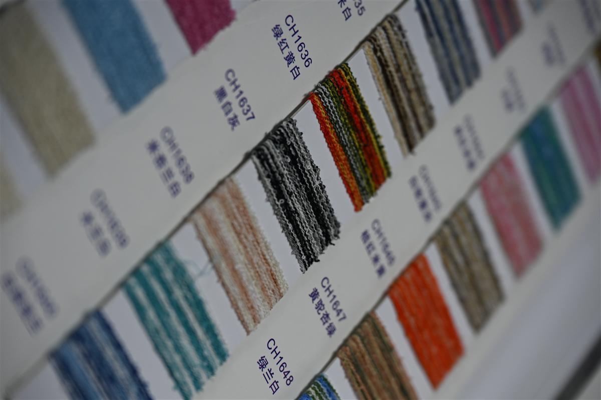
Waarom Pantone-naar-garen matching niet zo eenvoudig is als printen
Een Pantone-chip op papier is geen kleur die je direct kunt verven in een gestructureerd garen.
Hebt u ooit een Pantone-referentie naar een drukker gestuurd en binnen twee dagen een bijna perfecte match gekregen, dan valt het textielequivalent tegen. Garen is geen papier. Inkt blijft op het oppervlak liggen; verf dringt door tot in de kern van een vezel – en de vezel zelf verandert hoe uw oog de kleur waarneemt. Een Pantone TCX-code op een katoenen staal ziet er 20% lichter uit wanneer die op dezelfde tint op een geruwde tweed wordt toegepast, omdat het opstaande oppervlak licht anders verstrooit. Dit is het eerste dat elke opkomende ontwerper op de harde manier leert, meestal na een flinke lab dip-factuur.
- Vezelsamenstelling: Wol, polyester en viscose absorberen verf in verschillende snelheden. Een enkel Pantone-recept vertaald naar een wolrijk bouclé zal donkerder en meer verzadigd overkomen dan hetzelfde recept op een katoen-linnen effen weefsel.
- Garentextuur: Slub-garens, chenille en lussenbouclé creëren micro-schaduwen. Ons laboratorium compenseert dit door meerdere geverfde partijen – soms 3 tot 4 verwante tinten – vooraf te mengen tot één garenstreng, zodat de afgewerkte stof overeenkomt met de beoogde Pantone, niet als een vlakke, dode match.
- Het verfstadium is belangrijk: Stukverven (het verven van afgewerkte stof) is goedkoper, maar geeft je minder controle. Wij verven op het garenstadium. Daarom kost een 100-meter aangepaste kleurenrun ongeveer 30% minder dan vergelijkbare Europese weverijen: kleinere verfpartijen, minder afval en een strakkere kleurtolerantie per kegel garen.
De lab-dip stap is niet optioneel als je een betrouwbare match wilt onder realistische verlichting. Onder D65 daglichtsimulatoren – de standaard in textielkleurevaluatie – kan een tweed die identiek lijkt aan je Pantone-staal onder showroomspots merkbaar afwijken. Daarom vragen wij om fysieke kleurstandaarden in plaats van alleen een screenshot. Een stuk garen, een geverfd chipje of zelfs een gevallen blad bevat betrouwbaardere kleurgegevens dan een JPEG op een verlicht scherm.
Metamerisme is de stille moordenaar van aangepaste kleurprogramma's. Twee stoffen kunnen perfect matchen onder één lichtbron en botsen onder een andere. Voor tweedmengsels met metaaldraden wordt dit effect versterkt. Onze ververs evalueren lab-dips onder D65, TL84 (typisch winkellicht) en gloeilamp A om te zorgen dat de kleur standhoudt in de studio van een koper, een showroom en op een catwalk – voordat je je ooit vastlegt op productieyardage.
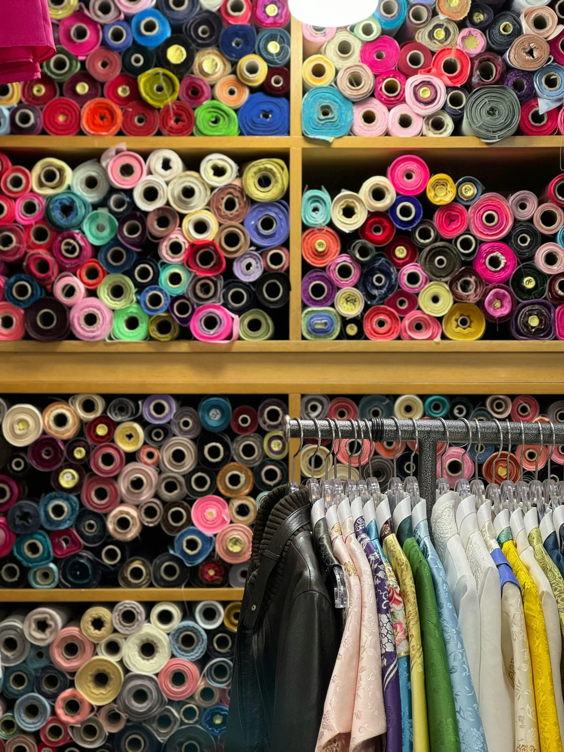
Stap 1: Indienen van je kleurreferentie – Digitaal versus Fysiek
Je scherm liegt tegen je.
I watched a designer lose a substantial order last year because the ‘navy’ tweed that landed on her desk didn’t match the ‘navy’ on her moodboard. The culprit wasn’t the dye recipe. It was a digital photo she’d pulled from Pinterest and emailed to the mill as a color reference. If you’ve never worked with yarn-dyed textures before, here’s the uncomfortable truth: the standard advice to ‘just send a Pantone code’ is bad advice if that code only exists on your iPhone screen.
De instinct van de opkomende ontwerper is om te screenshotten, bij te voegen en te hopen. Ons lab ontvangt wekelijks drie categorieën kleurinzendingen. De eerste is de digitaal-only referentie — een hexcode, een Canva-palet, een Instagram-post. De tweede is een fysiek staal — een uitsnede van een concurrent, een lippenstifthouder, een gedroogde bloem. De derde is een professionele Pantone textielstandaard — TCX of TPG. Het slagingspercentage voor eerste lab-dip goedkeuring voor digitaal-only referenties ligt onder de 30%. Voor fysieke referenties met een gedefinieerde lichtbron springt het boven de 85%. Het verschil zit niet in vaardigheid. Het is natuurkunde.
- Digitaal (Schermgebaseerde Referentie): Uw monitor geeft kleur weer met RGB-licht. Garen absorbeert en reflecteert licht. Een merino bouclé geverfd om een on-screen lavendel te matchen, zal vlak en levenloos overkomen omdat het scherm de schaduwplekken die door slub-garens worden gecreëerd, niet kan simuleren. Voeg ongekalibreerde beeldschermen en platformcompressie-artefacten toe, en u vraagt een verfmeester effectief om blind een bewegend doel te raken.
- Fysiek (Tactiele Referentie): Een stofuitsnede, Pantone TCX katoenen staal, of zelfs een geverfde chip geeft het lab een statische reflectiewaarde om te meten met een spectrophotometer. We meten het onder D65 (kunstmatig daglicht) bij een waarnemingshoek van 10 graden — de textielindustrie standaard voor studio-naar-catwalk consistentie. Het instrument leest de precieze spectrale curve, niet een interpretatie van een schermkleur.
- Het TCX vs TPG Probleem: Pantone TCX-referenties zijn gedrukt op papier. TPG-referenties zijn geverfd op katoen. Op glad papier ziet kleur er ongeveer 15-20% meer verzadigd uit dan hetzelfde formaat op geruwde tweed of gestructureerd breiwerk. Wanneer ontwerpers een TCX-chip indienen voor een zwaar bouclé-programma, zal de lab-dip die overeenkomt met de reflectie van de chip er doffer uitzien in stofvorm. Hiermee houden we rekening — maar alleen als we weten dat u een papieren standaard indient.
Wat werkelijk werkt voor een programma met een lage minimale bestelhoeveelheid van op maat geverfde tweed, is eenvoudig. Stuur een fysieke referentie. Een uitsnede van 2x2 inch is voldoende. Als die referentie afkomstig is van een kledingstuk dat u reverse-engineert, knip dan van een binnennaad waar UV-verkleuring het oppervlak niet heeft bereikt. Plak het op een kaart met uw PO-nummer en de gewenste lichtbron voor evaluatie (als u niet specificeert, wordt de
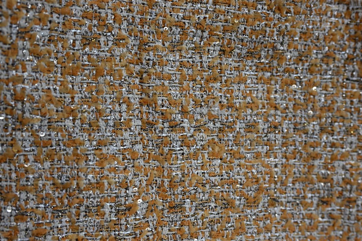
Stap 2: Het Lab-Dip Proces: Mini-verfloten voor Goedkeuring
Labdips voorkomen een kostbare fout bij een productierun van 200 m
You approved a digital color, the fabric landed, and it’s three shades off. A young designer once ate a substantial write-off because a pre-production sample didn’t match the bulk. That’s exactly the pain point the lab dip process eliminates — and it’s not optional if you’re doing a 100m custom dye lot on a Chanel-style tweed.
Zo werkt het in de praktijk: zodra u een Pantone-referentie en fysieke garenstalen indient, vertaalt een verfmeester dat recept op een schaal van 1:2000. We koken een miniatuur garenhaspel — typisch 10–20 gram — in een gecontroleerd verfbad, drogen het en breien een staal van 10 cm x 10 cm. Dit is geen computersimulatie. Het is een fysieke kleurproef op uw exacte vezelblend.
- Vezel is belangrijker dan u denkt.: Kleur oogt 20% lichter op glad katoen versus het genopte oppervlak van een wolblend tweed. We matchen onder D65-daglicht, omdat uw koper dat in een showroom inspecteert — niet onder warme LED.
- Garenstructuur verschuift verzadiging.: Slub and bouclé yarns absorb dye unpredictably. A solid-dye approach gives you flat, one-dimensional color. Spinning at our partner mills pre-blends the yarns, so you get multi-tonal melange effects that a simple lab dip on ready-made yarn can’t replicate.
- Lab dip is niet alleen kleur — het is handgevoel.: Het ministaal vertelt u ook of het verfrecept de zachtheid of val heeft veranderd. We hebben 15% van de eerste dips afgekeurd omdat de afwerking te stijf aanvoelde tegen onze Heavyweight Bouclé-benchmark.
Voor opkomende ontwerpers is de aarzeling meestal over de kosten. Een lab dip bij een standaard commissie-weverij kan $150–$300 per kleur kosten. Maar als u een custom run van 100m ontwikkelt, bespaart verven in de garenfase in plaats van in stukgoed afval, waardoor uw totale kleurmatchkosten bij ons typisch 30% lager uitkomen dan bij equivalente Europese weverijen. U krijgt drie lab-dip-revisies voordat u overgaat tot bulkgoedkeuring, en elke wordt verzonden als een fysiek staal — geen giswerk op het scherm.
Een duur gekocht advies: keur nooit een lab-dip goed in uw appartement 's nachts. Zorg voor een D65-kijkcabine of ga op zijn minst rond het middaguur naar buiten. Metamerisme is een echt probleem — de kleur matcht onder kantoorlicht maar verschuift naar groen in natuurlijk daglicht. Door te matchen onder D65 zorgen we ervoor dat uw goedgekeurde dip er hetzelfde uitziet van studio tot catwalk.
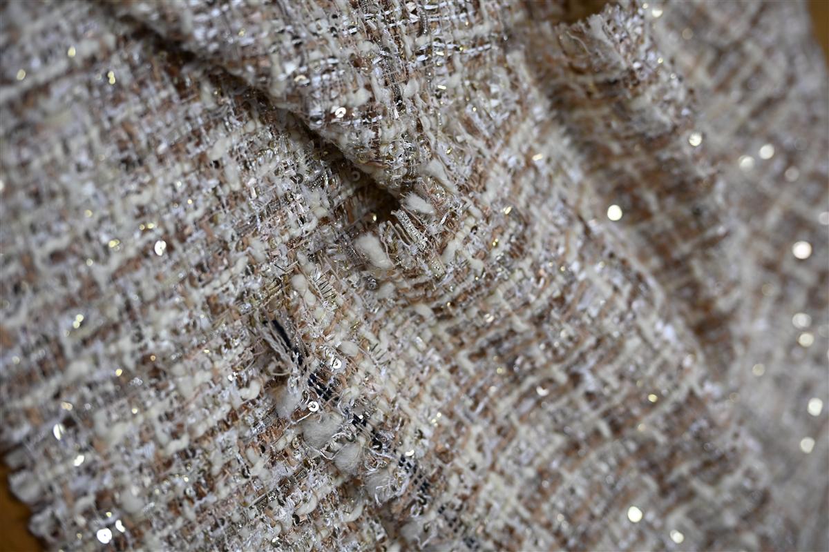
Stap 3: Kleurvariatie Begrijpen: Licht, Metamerisme en Vezelmengsels
Kleur lijkt 20% lichter op glad katoen dan op geruwde tweed; we matchen onder D65-licht om de uitstraling van catwalk tot winkel vast te leggen.
U opent de zending, pakt het eerste jasje en uw maag draait om. De tweed die in uw studio als een warme kameel oogde, ziet er nu modderig grijs uit onder de spotlights van de boetiek. De verfpartij is dezelfde. De Pantone-referentie is niet veranderd. Wat u te pakken heeft is metamerisme — twee materialen die matchen onder één lichtbron, maar uit elkaar gaan onder een andere. Dit is de verborgen kostenpost bij het matchen van op maat gemaakte stofkleuren, vooral bij vezelmengsels waar katoen, wol en polyester elk anders kleurstof opnemen.
Een lab-dip goedgekeurd op glad katoenen poplin zal falen op bouclé of kabelssteek omdat textuur licht absorbeert. Op een geruwd tweedoppervlak verschijnt hetzelfde kleurrecept ongeveer 20% donkerder en verzadigder dan op de vlakke referentiekaart. Ons lab evalueert elke lab-dip onder D65 (kunstmatig daglicht) en controleert vervolgens onder lichtbron A (gloeilamp) om metamerische fouten op te sporen voordat er één meter garen geverfd is. Als een leverancier u slechts één lichtbron toont, keurt u blind goed.
- Vezelval: Dezelfde Pantone TCX-code op Australische merinowol kan een halve tint koeler uitvallen dan op gerecycled polyester. Vraag altijd een aparte lab-dip op de daadwerkelijke basisvezel, niet een generieke katoenen kaart.
- Textuurcompensatie: Slub, bouclé en zware breistructuren verstrooien licht. Een meting met een vlakke spectrofotometer op een garenkaart garandeert niets. Sta erop dat je een gebreid of geweven staal van een handweefgetouw van exact dezelfde constructie krijgt.
- Metamerisme Audit: We document every custom match at three light sources — D65, store fluorescent (TL84), and home incandescent (A) — to stop the ‘sample approval / bulk rejection’ fight before it starts.
De branchenorm voor een commerciële kleurmatch is een Delta E (ΔE) of 1.0 or less under D65. But if the pair drifts above 1.5 under a department store track light, the buyer will reject it regardless of what the spectro read in the lab. Write this into your trim sheet: “Lab dip must maintain ΔE ≤ 1.5 across D65, TL84, and A.” No exceptions. When you set that bar upfront, you filter out dyehouses that only chase the first match, not the right match.
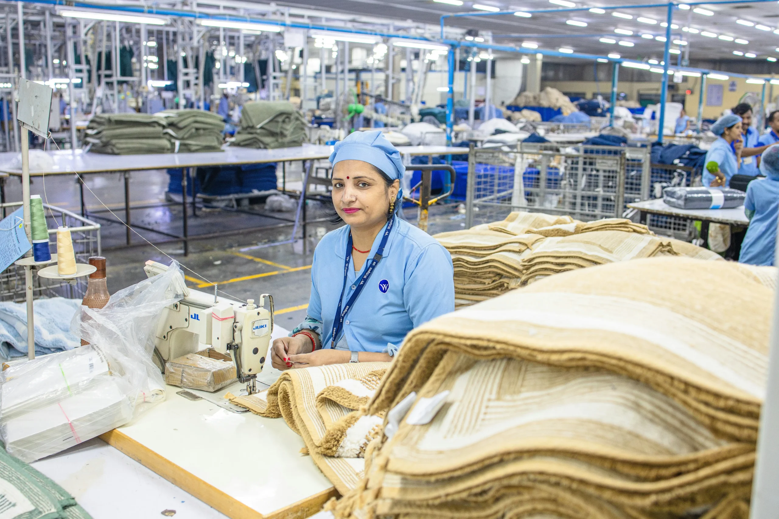
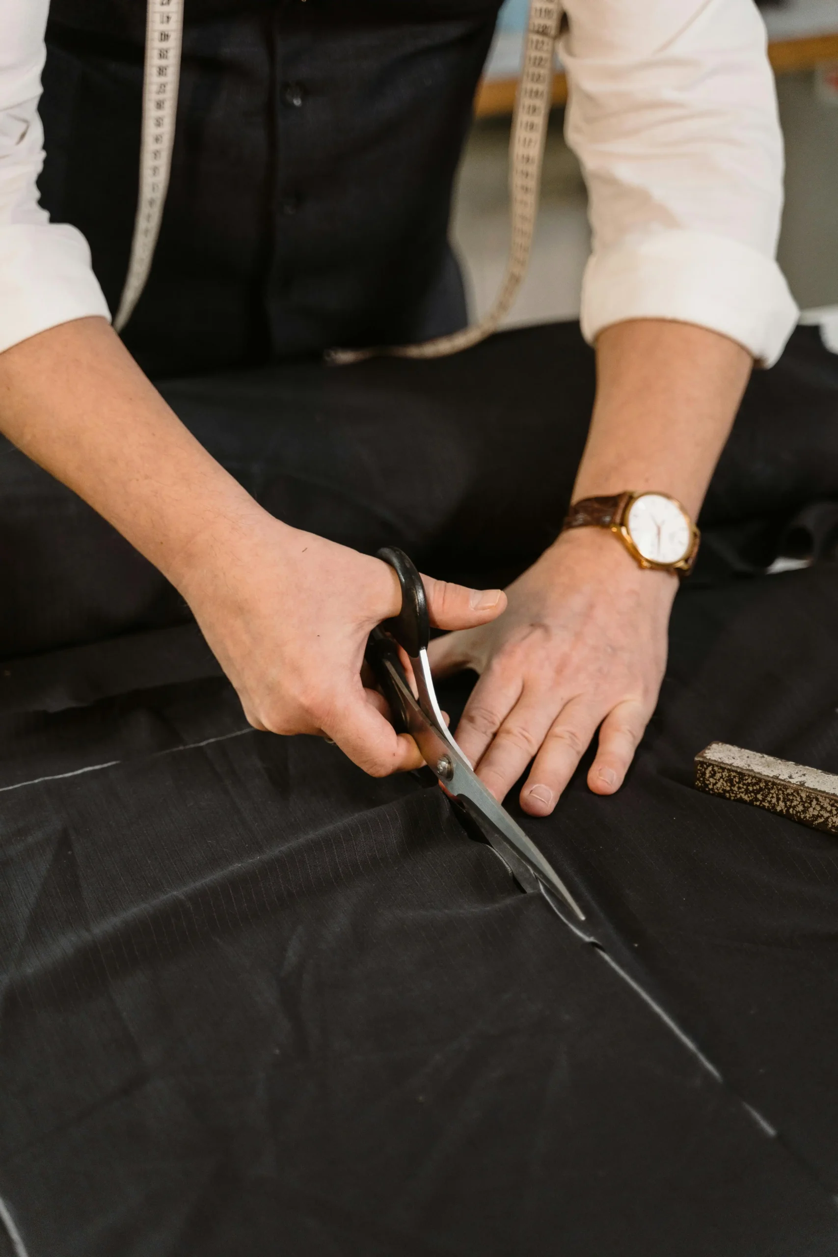
Stap 4: de 7-15-daagse kleurmatch-bemonstering van Fursone: wat u kunt verwachten
You don’t need a 1000m minimum to get your exact Pantone shade on a textured bouclé.
Most mills force emerging designers into a trap: they’ll dye a match, but only if you commit to 2,000 meters of piece-dyed fabric. That’s a risky gamble on a color you’ve only seen on a screen. Our sampling model flips this. Because our partner mills in Wenzhou dyes at the yarn stage—not on finished rolls—we can run a 100-meter custom color lot without the waste that inflates costs at European mills. You actually see your color on the exact slub, bouclé, or cable-knit yarn you’ll use in production.
- Dag 1–2: Receptvertaling: Your Pantone TCX reference arrives. Our lab doesn’t just match the hex code. They decompose it into a multi-yarn recipe because a solid dye bath on a single fiber will never replicate the tonal depth of a tweed. For a marled charcoal, that means three separate mini-dye pots running simultaneously.
- Dag 3–4: Lab Dip Execution: Er worden drie kleine garenpartijen gesponnen – elk een variatie op de doeltint (lichter, precies goed, donkerder). Die worden gebreid tot swatches van 15 cm × 15 cm op dezelfde gaugemachine die jouw bulkbreisel gebruikt. Een lab dip op glad katoen oogt 20% lichter dan hetzelfde recept op een geruwde tweed, dus je krijgt van ons nooit een generiek staal te zien.
- Dag 5: D65-lichthutvalidatie: Elk staal gaat onder gecontroleerde D65-verlichting—de internationale standaard voor modestudio's. Metamerie maakt collecties kapot. Een wol-lurex-mengeling die onder kantoorled uw Pantone matcht, kan onder een catwalkspot groen uitslaan. Wij keuren elk lab dip af waarbij de ΔE (Delta E) meer dan 1,5 bedraagt onder D65, ISO 105-J03-omstandigheden.
- Dag 6–7: verzending van de fysieke stalenkit: Je ontvangt drie goedgekeurde labdip-opties via expreskoerier, elk voorzien van de exacte code van het verfrecept en een garenstukje van 2 gram voor je eigen brandtest. Deze kit komt 7 kalenderdagen na de kleurgoedkeuring aan.
The benchmark that matters: on your next supplier call, ask whether their lab dip is done on your actual yarn construction or a standard cotton card. If they can’t answer in 10 seconds, expect a 2–3 shade delta between sample approval and bulk delivery. I’ve seen that gap cost a buyer a substantial amount in re-dye fees. We eliminate it by sampling what we spin.
Conclusie
a substantial order implodes the moment the buying team realizes the mass production run has a cooler base tone than the pre-production sample they signed off on two months earlier. The dye recipe was solid, the lab dip was approved, but nobody specified the quality tolerance for the lightbox conditions. Professionals know that a Pantone match on a napped tweed isn’t finished until you’ve measured the Delta E under D65 light and locked the approved swatch into the purchase contract. That final 10%—the sample approval protocol establishing a Delta E ceiling of 1.0 or tighter—is what separates a flawless collection launch from an expensive warehouse of off-spec goods.
Voordat je je vastlegt op een bulkverfbad, vraag je een monsternamekit voor kleurmatch binnen 7 dagen aan, inclusief een bewaard strike-off voor je administratie. Een weverij die in het garenstadium verft in plaats van op de stof, levert die nauwkeurigheid terwijl je CIF-kosten 30 % onder de Europese benchmarks blijven.
Veelgestelde vragen
Kunt u mijn Pantone-code exact in garen matchen?
No, a perfect 1:1 match isn’t possible because yarn absorbs dye differently than coated paper. Fiber type, texture, and luster all shift how the color reads, so the goal is. Approve only after seeing the physical lab dip in your real lighting.
Hoe snel kan ik een kleurstaal op maat krijgen?
Onze partnermolens in Wenzhou verzenden binnen 7 dagen na ontvangst van uw Pantone-referentie en volledige garenspecificatie een fysieke labdip. Deze snelheid geldt voor tweed en breisels op maat wanneer de benodigde grondstoffen er zijn. Controleer de beschikbaarheid van garen voordat u een staal binnen 7 dagen verwacht.
Waarom ziet mijn tweedstaal er anders uit onder winkellicht?
Metamerism—where two colors match under one light but shift under another—is common in textured multi-yarn blends. Always evaluate your lab dip under both D65 daylight and the specific lighting used in your. Judge your lab dip under your store’s actual lighting conditions.
What’s the biggest mistake in custom color matching?
Een kleur goedkeuren op basis van een digitaal bestand of een telefoonfoto in plaats van een fysieke lab dip. Schermen vervormen tint en verzadiging enorm, wat leidt tot afkeuring van partijen en herwerkkosten. Keur een custom kleur nooit goed vanaf een scherm—neem altijd het echte staal in de hand.
Gezaghebbende bronnen

Gerelateerde inzichten

How to Compare Fabric Quotes from Three Mills: A Side-by-Side Method
Three mills return three quotes for the same fabric brief, and the spread between them...

Capaciteitsplanning rond Chinees Nieuwjaar: een stoffabriek boeken
Every year, fabric buyers lose the same three weeks to the same event: Chinese New...

Strategie voor een tweede leverancier: hoe merken een tweede tweedweverij kwalificeren
Single-sourcing a signature fabric feels efficient right up to the season it fails: the mill’s...