

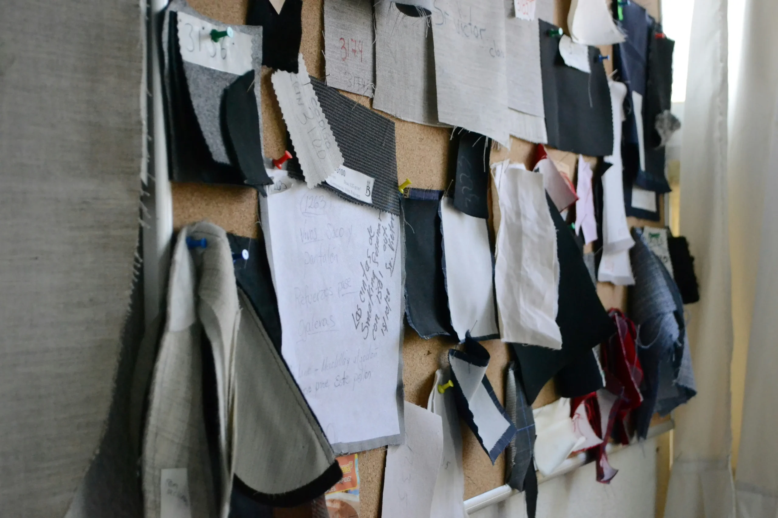
Tilpasning af stoffarve er det første kontrolpunkt, købere bør låse, før de godkender en leverandør, budget eller produktionsslot. Hvorfor landede en betydelig tweedordre på min kaj og så to nuancer lysere ud end præproduktionsprøven, jeg godkendte? Hvis du stiller det spørgsmål bag lukkede døre, aner du allerede, at standard svaret – ”skærmkalibrering” eller “farvepartivariation” – ikke er den virkelige årsag. Den virkelige årsag ligger i krydsfeltet mellem skræddersyet farvematchning af stof and yarn dye reality: a Pantone reference on a backlit screen simply doesn’t account for how slub, bouclé, and napped wool absorb and scatter light.
Jeg lærte dette på den hårde måde, da jeg udførte leverandøraftjek på tværs af flere lande. En laboratorieprøve på en glat bomuldskarton kan bestå med glans, kun for at vise sig 20 % lysere på den færdige tweed, fordi fibrenes luv fanger D65-lys forskelligt. Det er her, prøvegodkendelsesdisciplin og stramme kvalitetstoleranceformuleringer – skrevet ind i FOB-prisbetingelserne – gør eller bryder en produktionsserie. Processen handler ikke kun om at sende en hex-kode og vente. Det handler om at forstå TCX versus TPG tekstilfarvereferencer, vide hvornår metameri bider dig i tværs af forretningsbelysning, og få farveopskriftsoversættelsen til at fungere for flertonede meleringsgarner i stedet for flade stykvarer.
Here’s the benchmark I give every emerging designer before their first call: if your mill can’t produce a lab dip under D65 light, evaluated side-by-side with your original reference swatch and a target Delta E of 1.0 or tighter, you’re not matching colour—you’re gambling. Write that down. It’ll save you more than any colour book ever will.
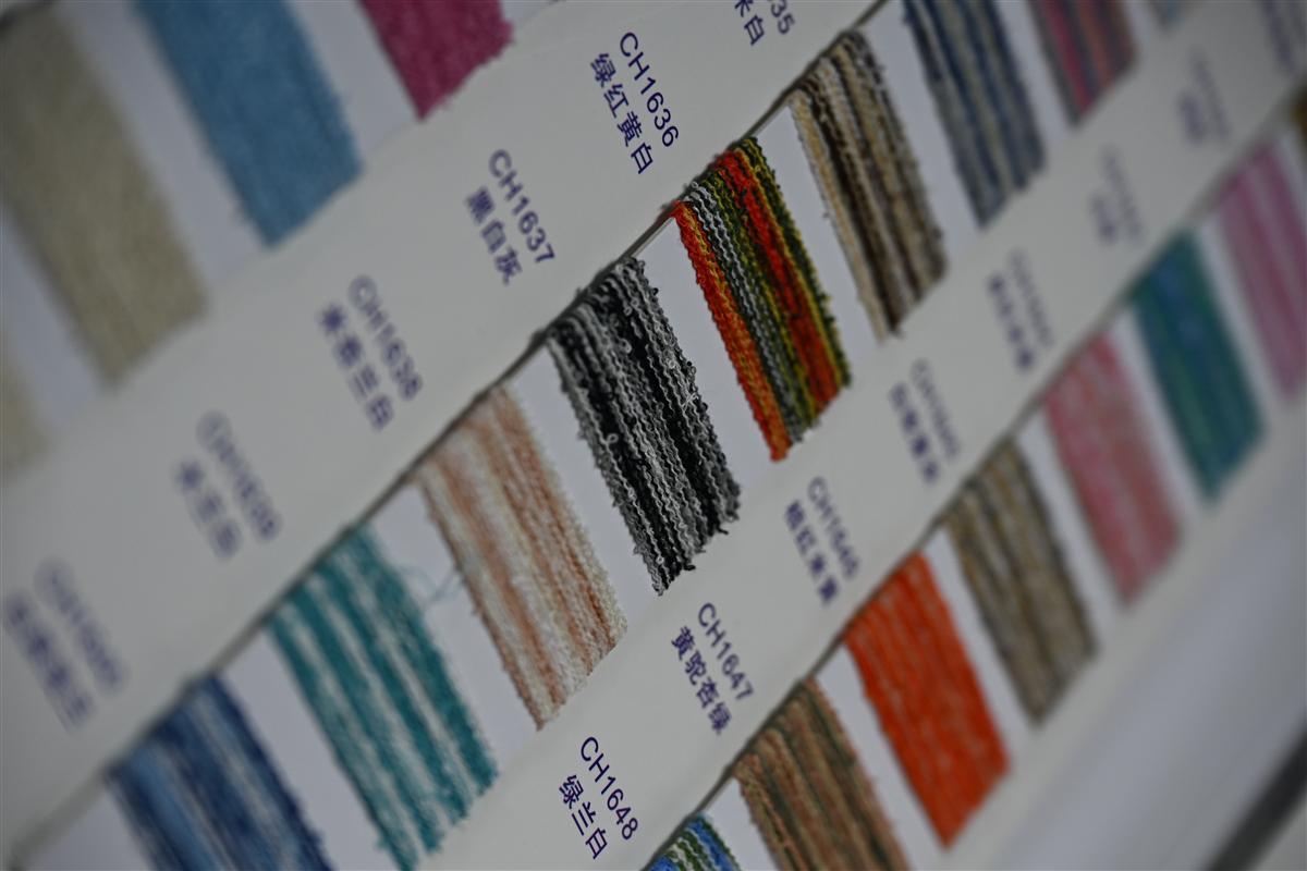
Hvorfor matchning fra Pantone til garn ikke er så enkelt som at printe
En Pantone-chip på papir er ikke en farve, du kan farve direkte ind i et struktureret garn.
Hvis du nogensinde har sendt en Pantone-reference til en printer og modtaget en næsten perfekt match på to dage, vil du blive skuffet over tekstilækvivalenten. Garn er ikke papir. Blæk sidder på overfladen; farve trænger ind i fibrenes kerne – og selve fiberen ændrer, hvordan dit øje opfatter farven. En Pantone TCX-kode på en bomuldsswatch vil se 20 % lysere ud, når den anvendes på samme nuance på en lurvet tweed, fordi den ophøjede overflade spreder lys forskelligt. Dette er det første, enhver nybegynderdesigner lærer på den hårde måde, normalt efter en stor laboratorieprøveregning.
- Fiberkomposition: Uld, polyester og viskose optager farve i forskelligt tempo. En enkelt Pantone-opskrift overført til en uldrig bouclé vil fremstå mørkere og mere mættet end den samme opskrift på en lærredsvævning af bomuld og hør.
- Yarn texture: Knudegarn, chenille og løkkebouclé skaber mikroskygger. Vores laboratorium kompenserer ved at forblende flere farvede partier—nogle gange 3 til 4 beslægtede nuancer—i én enkelt garnstråle, så det færdige stof fremstår som den ønskede Pantone og ikke som et fladt, dødt match.
- Dye stage matters: Stykfarvning (farvning af færdigt stof) er billigere, men giver dig mindre kontrol. Vi dye at the yarn stage. Derfor koster et specialfarvet farveparti på 100 m cirka 30 % mindre end tilsvarende europæiske væverier: mindre farvepartier, mindre spild og strammere farvetolerance gennem hver garncone.
Trinnet med lab dip er ikke valgfrit, hvis du vil have et pålideligt match under virkelige lysforhold. Under D65-dagslyssimulatorer — standarden inden for tekstilfarvevurdering — kan en tweed, der ser identisk ud med din Pantone-prøve under spotlight i showroomet, drive mærkbart. Derfor beder vi om fysiske farvestandarder i stedet for bare et skærmbillede. Et stykke garn, en malet chip eller endda et nedfaldet blad indeholder mere troværdige farvedata end en JPEG på en bagbelyst skærm.
Metamerisme er den stille dræber for skræddersyede farveprogrammer. To stoffer kan matche perfekt under én lyskilde og skære sig under en anden. For tweedblandinger med metalliske tråde forstærkes effekten. Vores farvere vurderer lab dips under D65, TL84 (typisk butikslys) og glødelampe A for at sikre, at farven holder i et købers studio, i et showroom og på en catwalk – før du overhovedet binder dig til produktionsmeter.
Trin 1: Indsendelse af din farvereference – digital eller fysisk
Din skærm lyver for dig.
Jeg så en designer miste en betydelig ordre sidste år, fordi den ‘marineblå’ tweed, der landede på hendes skrivebord, ikke matchede den ‘marineblå’ på hendes moodboard. Synderen var ikke farveopskriften. Det var et digitalt foto, hun havde trukket fra Pinterest og e-mailet til møllen som en farvereference. Hvis du aldrig har arbejdet med garnfarvede teksturer før, her er den ubehagelige sandhed: standardrådet om at ‘bare send en Pantone-kode’ er dårligt råd, hvis den kode kun eksisterer på din iPhone-skærm.
The emerging designer’s instinct is to screenshot, attach, and hope. Our lab receives three categories of color submissions weekly. The first is the digital-only reference — a hex code, a Canva palette, an Instagram post. The second is a physical swatch — a competitor’s cutting, a lipstick case, a dried flower. The third is a professional Pantone textile standard — TCX or TPG. The success rate on first-pass lab dip approval for digital-only references sits below 30%. For physical references with a defined light source, it jumps above 85%. The gap isn’t skill. It’s physics.
- Digital (skærmbaseret reference): Your monitor emits color using RGB light. Yarn absorbs and reflects light. A merino bouclé dyed to match an on-screen lavender will read flat and lifeless because the screen can’t simulate the shadow pockets created by slub yarns. Add in uncalibrated displays and platform compression artifacts, and you’re effectively asking a dye master to hit a moving target blindfolded.
- Fysisk (taktil reference): Et stofsnit, en Pantone TCX-bomuldsprøve eller bare en malet chip giver laboratoriet en statisk reflektansværdi, som kan måles med et spektrofotometer. Vi måler den under D65 (kunstigt dagslys) ved 10 graders observatørvinkel – tekstilindustriens standard for ensartethed fra studiet til catwalken. Instrumentet aflæser den præcise spektralkurve, ikke en fortolkning af en skærmfarve.
- The TCX vs TPG Problem: Pantone TCX references are printed on paper. TPG references are dyed on cotton. On smooth paper, color looks approximately 15-20% more saturated than the same formula on napped tweed or textured knit. When designers submit a TCX chip for a heavyweight bouclé program, the lab dip that matches the chip’s reflectance will look duller in fabric form. We account for this — but only if we know you’re submitting a paper standard.
What actually works for a low minimum order custom dyed tweed program is simple. Ship a physical reference. A 2×2 inch cutting is sufficient. If that reference is from a garment you’re reverse-engineering, cut from an inside seam where UV fade hasn’t hit the surface. Tape it to a card with your PO number and preferred light source for evaluation (if you don’t specify, the
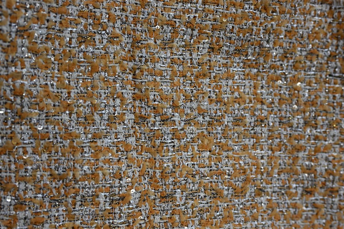
Trin 2: Lab-dip-processen: minifarvepartier til godkendelse
Laboratorieprøver forhindrer en kostbar fejl på en 200 m serie.
Du godkendte en digital farve, stoffet landede, og det er tre nuancer forkert. En ung designer engang spiste en betydelig nedskrivning, fordi en præproduktionsprøve ikke matchede bulk. Det er netop det smertepunkt, laboratorieprøveprocessen eliminerer – og det er ikke valgfrit, hvis du laver et 100 m specialfarvet parti på en Chanel-inspireret tweed.
Here’s how it actually works: once you submit a Pantone reference and physical yarn snips, a dye master translates that formula at a 1:2000 scale. We boil a miniature yarn hank — typically 10–20 grams — in a controlled dye bath, then dry it and knit up a 10cm x 10cm swatch. This isn’t a computer simulation. It’s a physical color proof on your exact fiber blend.
- Fiber betyder mere, end du tror.: Color appears 20% lighter on smooth cotton versus the napped surface of a wool-blend tweed. We match under D65 daylight because that’s how your buyer inspects it in a showroom — not under warm LED.
- Garnstruktur ændrer mætningen.: Slub and bouclé yarns absorb dye unpredictably. A solid-dye approach gives you flat, one-dimensional color. Spinning at our partner mills pre-blends the yarns, so you get multi-tonal melange effects that a simple lab dip on ready-made yarn can’t replicate.
- Lab dip isn’t just color — it’s hand feel.: The mini swatch also tells you if the dye recipe changed the softness or drape. We’ve rejected 15% of first-round dips because the finish felt too stiff against our Heavyweight Bouclé benchmark.
For emerging designers, the hesitation is usually about cost. A lab dip at a standard commission mill might run $150–$300 per color. But when you’re developing a 100m custom run, dyeing at the yarn stage instead of piece-goods cuts waste, which means your total color-match cost with us typically lands 30 % under tilsvarende europæiske væverier. Du får tre lab-dip-revisioner, før der skiftes til bulk-godkendelse, og hver enkelt sendes som en fysisk farveprøve – ingen gætteri på skærmen.
Et dyrekøbt råd: godkend aldrig en lab dip i din lejlighed om aftenen. Skaff dig en D65-lysboks, eller gå i det mindste udenfor midt på dagen. Metameri er et reelt problem — farven matcher i kontorlys, men slår over i grønt i naturligt dagslys. Ved at matche under D65 sikrer vi, at din godkendte dip fremstår ens fra studio til catwalk.
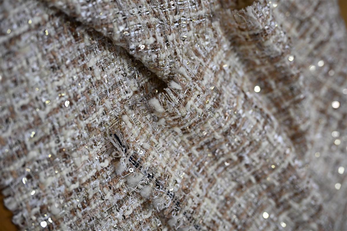
Trin 3: At forstå farvevariation: lys, metameri og fiberblandinger
Farven læses 20 % lysere på glat bomuld end på ru tweed; vi matcher under D65-lys for at låse udseendet fra catwalk til butik.
Du åbner forsendelsen, tager den første jakke ud, og maven synker. Det tweed, der så varmt camel ud i dit studium, fremstår nu mudret gråt under butikkens skinnebelysning. Farvepartiet er det samme. Den Pantone-reference hasn’t changed. What bit you is metamerism — two materials that match under one light source but shift apart under another. This is the hidden cost driver in custom fabric color matching, especially for fiber blends where cotton, wool, and polyester each grab dye differently.
En lab-dip, der er godkendt på glat bomuldspoplin, vil fejle på en bouclé eller kabelstrik, fordi tekstur spiser lys. På en ru tweedoverflade virker den samme farveopskrift cirka 20 % mørkere og mere mættet, end den gjorde på det flade referencekort. Vores laboratorium vurderer hver lab-dip under D65 (kunstigt dagslys) og krydstjekker derefter under lyskilde A (glødelampe) for at fange metamerifejl, før en eneste meter garvet garn bindes. Hvis en leverandør kun viser dig én lyskilde, godkender du i blinde.
- Fiber Trap: Den samme Pantone TCX-kode på australsk merinould kan lande en halv nuance koldere end på genanvendt poly. Bed altid om en separat farveprøve på den faktiske basisfiber, ikke et generisk bomuldskort.
- Texture Offset: Slub, bouclé og tunge strikkonstruktioner spreder lyset. En måling med flad spektrofotometer på et garnkort garanterer ingenting. Kræv en strikket eller vævet håndvæverprøve i præcis samme konstruktion.
- Metamerisme Audit: We document every custom match at three light sources — D65, store fluorescent (TL84), and home incandescent (A) — to stop the ‘sample approval / bulk rejection’ fight before it starts.
Branchestandarden for et kommercielt match er en Delta E (ΔE) of 1.0 or less under D65. But if the pair drifts above 1.5 under a department store track light, the buyer will reject it regardless of what the spectro read in the lab. Write this into your trim sheet: “Lab dip must maintain ΔE ≤ 1.5 across D65, TL84, and A.” No exceptions. When you set that bar upfront, you filter out dyehouses that only chase the first match, not the right match.
Trin 4: Fursones 7-dages farvematchning: hvad du kan forvente
Du behøver ikke et minimum på 1000 m for at få din præcise Pantone-nuance på en struktureret bouclé.
Most mills force emerging designers into a trap: they’ll dye a match, but only if you commit to 2,000 meters of piece-dyed fabric. That’s a risky gamble on a color you’ve only seen on a screen. Our sampling model flips this. Because our partner mills in Wenzhou dyes at the yarn stage—not on finished rolls—we can run a 100-meter custom color lot without the waste that inflates costs at European mills. You actually see your color on the exact slub, bouclé, or cable-knit yarn you’ll use in production.
- Dag 1–2: Opskriftsoversættelse: Your Pantone TCX reference arrives. Our lab doesn’t just match the hex code. They decompose it into a multi-yarn recipe because a solid dye bath on a single fiber will never replicate the tonal depth of a tweed. For a marled charcoal, that means three separate mini-dye pots running simultaneously.
- Dag 3–4: Lab Dip Execution: Vi spinner tre små garnpartier - hver en variant af den ønskede farvetone (lysere, præcis, mørkere). De strikkes til prøver på 15 cm × 15 cm på samme maskine og finhed, som din bulkstrik skal køre på. En lab-dip på glat bomuld ser 20 % lysere ud end samme opskrift på en ru tweed, så vi viser dig aldrig en generisk prøve.
- Dag 5: Validering i D65 lysboks: Enhver stofprøve vurderes under kontrolleret D65-belysning – den internationale standard for modestudier. Metameri slår kollektioner ihjel. En uld-lurex-blanding, der matcher din Pantone under kontor-LED, kan skifte mod grønt under en catwalk-spot. Vi afviser enhver dip, hvor ΔE (Delta E) overstiger 1,5 under D65, ISO 105-J03-forhold.
- Dag 6–7: afsendelse af fysisk stofprøvesæt: Du får tre godkendte laboratoriefarveprøver via ekspreskurer, hver mærket med den præcise farveopskriftskode og en 2-grams garnprøve til din egen brændtest. Dette kit ankommer 7 kalenderdage efter farvegodkendelse.
Den benchmark, der betyder noget: på dit næste leverandøropkald, spørg om deres laboratorieprøve udføres på din faktiske garnkonstruktion eller en standard bomuldskarton. Hvis de ikke kan svare på 10 sekunder, forvent et 2-3 nuanceafvigelse mellem prøvegodkendelse og bulkleverance. Jeg har set det hul koste en køber et betydeligt beløb i genfarvede gebyrer. Vi eliminerer det ved at prøve det, vi spinder.
Konklusion
En betydelig ordre imploderer i det øjeblik, indkøbsteamet indser, at masseproduktionen har en koldere grundtone end præproduktionsprøven, de godkendte to måneder tidligere. Farveopskriften var solid, laboratorieprøven blev godkendt, men ingen specificerede kvalitetstolerancen for lysboksforholdene. Professionelle ved, at en Pantone-match på en lurvet tweed ikke er færdig, før du har målt Delta E under D65-lys og låst den godkendte swatch ind i købskontrakten. Den sidste 10 % – prøvegodkendelsesprotokollen, der etablerer et Delta E-loft på 1,0 eller strammere – er hvad der adskiller en fejlfri kollektionlancering fra et dyrt lager af fejlbehæftede varer.
Før du binder dig til et bulk-farveparti, så bed om et farvematchnings-kit med 7 dages prøve, der indeholder et opbevaret strike-off til dit arkiv. Et væveri, der farver på garnstadiet i stedet for på metervare, kan levere den præcision og samtidig holde dine CIF-omkostninger 30 % under europæiske benchmark.
Ofte stillede spørgsmål
Kan du ramme min Pantone-kode præcist i garnet?
No, a perfect 1:1 match isn’t possible because yarn absorbs dye differently than coated paper. Fiber type, texture, and luster all shift how the color reads, so the goal is. Approve only after seeing the physical lab dip in your real lighting.
Hvor hurtigt kan jeg få en stofprøve i en specialfarve?
Vores partnervæverier i Wenzhou sender en fysisk labdip inden for 7 dage efter modtagelse af din Pantone-reference og komplette garnspecifikation. Denne hastighed holder for kundetilpassede tweeds og strik, når de nødvendige råvarer er tilgængelige. Bekræft garnets tilgængelighed, før du forventer en 7-dages prøve.
Hvorfor ser min tweedprøve anderledes ud under butikkens lys?
Metamerism—where two colors match under one light but shift under another—is common in textured multi-yarn blends. Always evaluate your lab dip under both D65 daylight and the specific lighting used in your. Judge your lab dip under your store’s actual lighting conditions.
What’s the biggest mistake in custom color matching?
At godkende en farve ud fra en digital fil eller et telefonfoto i stedet for en fysisk lab dip. Skærme forvrænger kulør og mætning dramatisk, hvilket fører til afviste partier og omkostninger til omarbejde. Godkend aldrig en specialfarve fra en skærm—tag altid den faktiske farveprøve i hånden.
Autoritative referencer

Relaterede indsigter

How to Compare Fabric Quotes from Three Mills: A Side-by-Side Method
Three mills return three quotes for the same fabric brief, and the spread between them...

Kapacitetsplanlægning omkring CNY: Book en stoffabrik før det kinesiske nytår
Every year, fabric buyers lose the same three weeks to the same event: Chinese New...

Strategi for sekundær leverandør: Sådan kvalificerer brands en ekstra tweedfabrik
Single-sourcing a signature fabric feels efficient right up to the season it fails: the mill’s...