

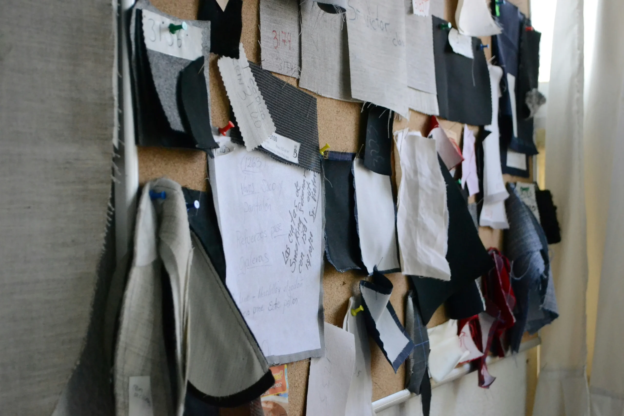
custom fabric color matching is the first checkpoint buyers should lock before they approve a supplier, budget, or production slot. Why did a substantial tweed order land on my dock looking two shades lighter than the pre-production sample I signed off on? If you’re asking that question behind closed doors, you already sense the standard answer—”monitor calibration” or “dye lot variation”—isn’t the real reason. The real reason sits at the intersection of custom fabric color matching and yarn dye reality: a Pantone reference on a backlit screen simply doesn’t account for how slub, bouclé, and napped wool absorb and scatter light.
I learned this the hard way running supplier audits across multiple countries. A lab dip on a smooth cotton card can pass with flying colours, only to show up 20% brighter on the finished tweed because the fibre’s nap catches D65 light differently. That’s where sample approval discipline and tight quality tolerance language—written into the FOB pricing terms—make or break a production run. The process isn’t just about sending a hex code and waiting. It’s about understanding TCX versus TPG textile colour references, knowing when metamerism will bite you across retail lighting, and making the dye recipe translation work for multi-tonal melange yarns instead of flat piece-goods.
Here’s the benchmark I give every emerging designer before their first call: if your mill can’t produce a lab dip under D65 light, evaluated side-by-side with your original reference swatch and a target Delta E of 1.0 or tighter, you’re not matching colour—you’re gambling. Write that down. It’ll save you more than any colour book ever will.
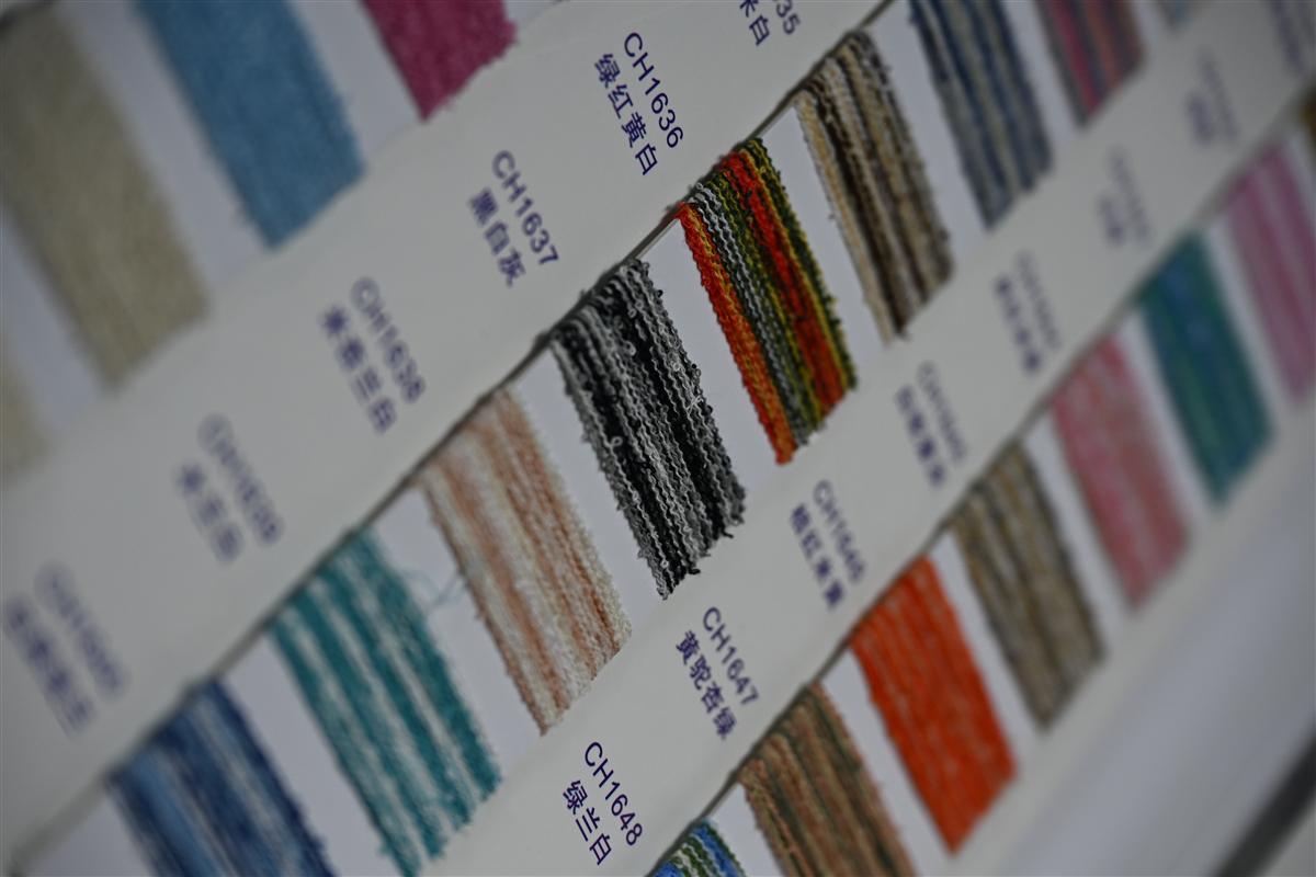
Why Pantone to Yarn Matching Isn’t as Simple as Printing
A Pantone chip on paper is not a color you can dye directly into a textured yarn.
If you’ve ever sent a Pantone reference to a printer and received a near-perfect match in two days, you’ll be disappointed by the textile equivalent. Yarn is not paper. Ink sits on the surface; dye penetrates a fiber’s core—and the fiber itself changes how your eye perceives the color. A Pantone TCX code on a cotton swatch will look 20% lighter when applied to the same shade on a napped tweed because the raised surface scatters light differently. This is the first thing every emerging designer learns the hard way, usually after a hefty lab dip bill.
- Fiber composition: Wool, polyester, and viscose absorb dye at different rates. A single Pantone recipe translated to a wool-rich bouclé will read darker and more saturated than the same recipe on a cotton-linen plain weave.
- Yarn texture: Slub yarns, chenille, and looped bouclé create micro-shadows. Our lab compensates by pre-blending multiple dyed lots—sometimes 3 to 4 related shades—into a single yarn strand so the finished fabric reads as the target Pantone, not as a flat, dead match.
- Dye stage matters: Piece-dyeing (dyeing finished cloth) is cheaper but gives you less control. We dye at the yarn stage. That’s why a 100-meter custom color run costs about 30% less than comparable European mills: smaller dye lots, less waste, and tighter color tolerance across each cone of yarn.
The lab dip step isn’t optional if you want a reliable match under real-world lighting. Under D65 daylight simulators—the standard in textile color evaluation—a tweed that looks identical to your Pantone swatch under showroom spotlights can drift noticeably. That’s why we request physical color standards instead of just a screenshot. A piece of yarn, a painted chip, or even a fallen leaf holds more trustworthy color data than a JPEG on a backlit screen.
Metamerism is the silent killer of custom color programs. Two fabrics can match perfectly under one light source and clash under another. For tweed blends containing metallic threads, this effect gets amplified. Our dyers evaluate lab dips under D65, TL84 (typical shop light), and incandescent A to ensure the color holds across a buyer’s studio, a showroom, and a runway—before you ever commit to production yardage.
Step 1: Submitting Your Color Reference – Digital vs Physical
Your screen is lying to you.
I watched a designer lose a substantial order last year because the ‘navy’ tweed that landed on her desk didn’t match the ‘navy’ on her moodboard. The culprit wasn’t the dye recipe. It was a digital photo she’d pulled from Pinterest and emailed to the mill as a color reference. If you’ve never worked with yarn-dyed textures before, here’s the uncomfortable truth: the standard advice to ‘just send a Pantone code’ is bad advice if that code only exists on your iPhone screen.
The emerging designer’s instinct is to screenshot, attach, and hope. Our lab receives three categories of color submissions weekly. The first is the digital-only reference — a hex code, a Canva palette, an Instagram post. The second is a physical swatch — a competitor’s cutting, a lipstick case, a dried flower. The third is a professional Pantone textile standard — TCX or TPG. The success rate on first-pass lab dip approval for digital-only references sits below 30%. For physical references with a defined light source, it jumps above 85%. The gap isn’t skill. It’s physics.
- Digital (Screen-Based Reference): Your monitor emits color using RGB light. Yarn absorbs and reflects light. A merino bouclé dyed to match an on-screen lavender will read flat and lifeless because the screen can’t simulate the shadow pockets created by slub yarns. Add in uncalibrated displays and platform compression artifacts, and you’re effectively asking a dye master to hit a moving target blindfolded.
- Physical (Tactile Reference): A fabric cutting, Pantone TCX cotton swatch, or even a painted chip gives the lab a static reflectance value to measure with a spectrophotometer. We measure it under D65 (artificial daylight) at 10-degree observer angle — the textile industry standard for studio-to-runway consistency. The instrument reads the precise spectral curve, not an interpretation of a screen color.
- The TCX vs TPG Problem: Pantone TCX references are printed on paper. TPG references are dyed on cotton. On smooth paper, color looks approximately 15-20% more saturated than the same formula on napped tweed or textured knit. When designers submit a TCX chip for a heavyweight bouclé program, the lab dip that matches the chip’s reflectance will look duller in fabric form. We account for this — but only if we know you’re submitting a paper standard.
What actually works for a low minimum order custom dyed tweed program is simple. Ship a physical reference. A 2×2 inch cutting is sufficient. If that reference is from a garment you’re reverse-engineering, cut from an inside seam where UV fade hasn’t hit the surface. Tape it to a card with your PO number and preferred light source for evaluation (if you don’t specify, the
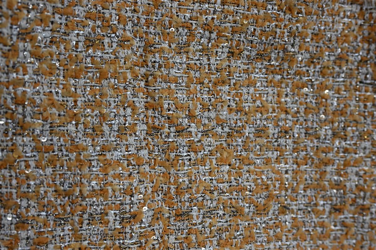
Step 2: The Lab Dip Process: Mini Dye Lots for Approval
Lab dips prevent a costly mistake on a 200m run.
You approved a digital color, the fabric landed, and it’s three shades off. A young designer once ate a substantial write-off because a pre-production sample didn’t match the bulk. That’s exactly the pain point the lab dip process eliminates — and it’s not optional if you’re doing a 100m custom dye lot on a Chanel-style tweed.
Here’s how it actually works: once you submit a Pantone reference and physical yarn snips, a dye master translates that formula at a 1:2000 scale. We boil a miniature yarn hank — typically 10–20 grams — in a controlled dye bath, then dry it and knit up a 10cm x 10cm swatch. This isn’t a computer simulation. It’s a physical color proof on your exact fiber blend.
- Fiber matters harder than you think.: Color appears 20% lighter on smooth cotton versus the napped surface of a wool-blend tweed. We match under D65 daylight because that’s how your buyer inspects it in a showroom — not under warm LED.
- Yarn structure shifts saturation.: Slub and bouclé yarns absorb dye unpredictably. A solid-dye approach gives you flat, one-dimensional color. Spinning at our partner mills pre-blends the yarns, so you get multi-tonal melange effects that a simple lab dip on ready-made yarn can’t replicate.
- Lab dip isn’t just color — it’s hand feel.: The mini swatch also tells you if the dye recipe changed the softness or drape. We’ve rejected 15% of first-round dips because the finish felt too stiff against our Heavyweight Bouclé benchmark.
For emerging designers, the hesitation is usually about cost. A lab dip at a standard commission mill might run $150–$300 per color. But when you’re developing a 100m custom run, dyeing at the yarn stage instead of piece-goods cuts waste, which means your total color-match cost with us typically lands 30% below equivalent European mills. You get three lab dip revisions before moving to bulk approval, and each one ships as a physical swatch — no guesswork on screen.
One hard-bought piece of advice: never approve a lab dip in your apartment at night. Get hold of a D65 viewing booth or, at minimum, step outside at midday. Metamerism is a real problem — the color matches under office light but shifts green in natural daylight. By matching under D65, we make sure your approved dip reads the same from studio to runway.
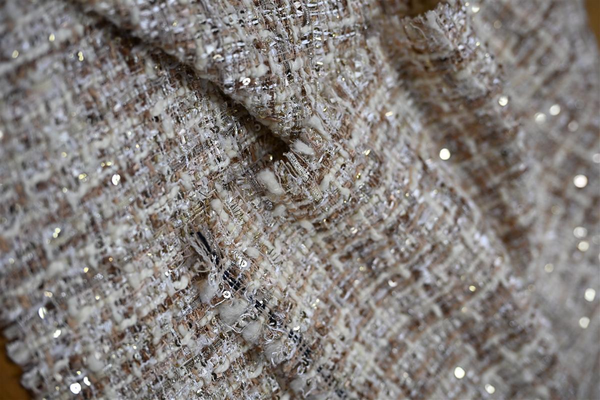
Step 3: Understanding Color Variation: Light, Metamerism, and Fiber Blends
Color reads 20% lighter on smooth cotton than on napped tweed; we match under D65 light to lock the runway-to-store appearance.
You open the shipment, pull the first jacket, and your stomach drops. The tweed that looked like a warm camel in your studio now reads a muddy gray under the boutique track lights. The dye lot is the same. The Pantone reference hasn’t changed. What bit you is metamerism — two materials that match under one light source but shift apart under another. This is the hidden cost driver in custom fabric color matching, especially for fiber blends where cotton, wool, and polyester each grab dye differently.
A lab dip approved on smooth cotton poplin will fail on a bouclé or cable knit because texture eats light. On a napped tweed surface, the same dye recipe appears roughly 20% darker and more saturated than it did on the flat reference card. Our lab evaluates every lab dip under D65 (artificial daylight), then cross-checks under illuminant A (incandescent) to catch metameric failures before a single yard of yarn dye is committed. If a supplier only shows you one light source, you are approving blind.
- Fiber Trap: The same Pantone TCX code on Australian Merino wool can land half a shade cooler than on recycled poly. Always request a separate lab dip on the actual base fiber, not a generic cotton card.
- Texture Offset: Slub, bouclé, and heavy knit structures scatter light. A flat-spectrophotometer reading on a yarn card guarantees nothing. Insist on a knitted or woven handloom swatch of the exact construction.
- Metamerism Audit: We document every custom match at three light sources — D65, store fluorescent (TL84), and home incandescent (A) — to stop the ‘sample approval / bulk rejection’ fight before it starts.
Industry standard for a commercial match is a Delta E (ΔE) of 1.0 or less under D65. But if the pair drifts above 1.5 under a department store track light, the buyer will reject it regardless of what the spectro read in the lab. Write this into your trim sheet: “Lab dip must maintain ΔE ≤ 1.5 across D65, TL84, and A.” No exceptions. When you set that bar upfront, you filter out dyehouses that only chase the first match, not the right match.
Step 4: Fursone’s 7-Day Color Match Sampling: What to Expect
You don’t need a 1000m minimum to get your exact Pantone shade on a textured bouclé.
Most mills force emerging designers into a trap: they’ll dye a match, but only if you commit to 2,000 meters of piece-dyed fabric. That’s a risky gamble on a color you’ve only seen on a screen. Our sampling model flips this. Because our partner mills in Wenzhou dyes at the yarn stage—not on finished rolls—we can run a 100-meter custom color lot without the waste that inflates costs at European mills. You actually see your color on the exact slub, bouclé, or cable-knit yarn you’ll use in production.
- Day 1–2: Recipe Translation: Your Pantone TCX reference arrives. Our lab doesn’t just match the hex code. They decompose it into a multi-yarn recipe because a solid dye bath on a single fiber will never replicate the tonal depth of a tweed. For a marled charcoal, that means three separate mini-dye pots running simultaneously.
- Day 3–4: Lab Dip Execution: We spin three small yarn batches—each a variation of the target shade (lighter, on-target, darker). These are knitted into 15cm × 15cm swatches on the same gauge machine your bulk knit will use. A lab dip on smooth cotton looks 20% lighter than the same recipe on a napped tweed, so we never show you a generic swatch.
- Day 5: D65 Light Booth Validation: Every swatch goes under controlled D65 lighting—the international standard for fashion studios. Metamerism kills collections. A wool-lurex blend that matches your Pantone under office LED can shift green under a runway spot. We reject any dip where the ΔE (Delta E) exceeds 1.5 under D65, ISO 105-J03 conditions.
- Day 6–7: Physical Swatch Kit Dispatch: You get three approved lab dip options via express courier, each tagged with the exact dye recipe code and a 2-gram yarn snippet for your own burn test. This kit arrives 7 calendar days from color sign-off.
The benchmark that matters: on your next supplier call, ask whether their lab dip is done on your actual yarn construction or a standard cotton card. If they can’t answer in 10 seconds, expect a 2–3 shade delta between sample approval and bulk delivery. I’ve seen that gap cost a buyer a substantial amount in re-dye fees. We eliminate it by sampling what we spin.
Conclusion
a substantial order implodes the moment the buying team realizes the mass production run has a cooler base tone than the pre-production sample they signed off on two months earlier. The dye recipe was solid, the lab dip was approved, but nobody specified the quality tolerance for the lightbox conditions. Professionals know that a Pantone match on a napped tweed isn’t finished until you’ve measured the Delta E under D65 light and locked the approved swatch into the purchase contract. That final 10%—the sample approval protocol establishing a Delta E ceiling of 1.0 or tighter—is what separates a flawless collection launch from an expensive warehouse of off-spec goods.
Before you commit to a bulk dye lot, request a 7-day color match sampling kit that includes a retained strike-off for your records. A mill that dyes at the yarn stage rather than piece-goods can deliver that accuracy while keeping your CIF costs 30% below European benchmarks.
Frequently Asked Questions
Can you match my Pantone code exactly in yarn?
No, a perfect 1:1 match isn’t possible because yarn absorbs dye differently than coated paper. Fiber type, texture, and luster all shift how the color reads, so the goal is. Approve only after seeing the physical lab dip in your real lighting.
How fast can I get a custom color swatch?
Our partner mills in Wenzhou ship a physical lab dip within 7 days of receiving your Pantone reference and complete yarn spec. This speed holds for custom tweeds and knits when the required raw materials are. Confirm yarn availability before expecting a 7-day swatch.
Why does my tweed sample look different under store lights?
Metamerism—where two colors match under one light but shift under another—is common in textured multi-yarn blends. Always evaluate your lab dip under both D65 daylight and the specific lighting used in your. Judge your lab dip under your store’s actual lighting conditions.
What’s the biggest mistake in custom color matching?
Approving a color via a digital file or phone photo instead of a physical lab dip. Screens distort hue and saturation dramatically, leading to batch rejections and rework costs. Never approve a custom color from a screen—always handle the actual swatch.
Authoritative References

Related Insights

How to Compare Fabric Quotes from Three Mills: A Side-by-Side Method
Three mills return three quotes for the same fabric brief, and the spread between them...

CNY Capacity Planning: Booking a Fabric Mill Around Chinese New Year
Every year, fabric buyers lose the same three weeks to the same event: Chinese New...

Second-Source Strategy: How Brands Qualify a Second Tweed Mill
Single-sourcing a signature fabric feels efficient right up to the season it fails: the mill’s...